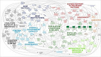
 A previous post, Brevity takes a lot of work, espoused this maxim: "The longer you think, the shorter the presentation." Today a topic in the news is that last word, "presentation", as in "PowerPoint presentation".
NYTimes.com reports today on how PowerPoint has infiltrated the military. You can also read this insider perspective from an Army captain. One of his observations is that "PowerPoint is everywhere--not only in the military, but also in the government and private sector."
And how. You've doubtless had some really bad PowerPoint experiences, either as an audience or perhaps as an author. Let's be honest, we've all used PowerPoint as a crutch, and the results aren't pretty.
One of my colleagues tells a good story about one of her mentors starting out at a local agency in Kentucky. The advice given about using PowerPoint was simple and straightforward: "Pictures and sayings."
Authors or presenters who follow this advice make it a joy to be in the audience. Keeping your content reduced to "pictures and sayings" usually means you have made your message exciting and sharp. As such, you can ad lib easily because your story is clear in your own mind.
Sometimes a PowerPoint presentation (or "deck" in the vernacular) really does need to have a lot of words, usually because it's meant to "travel" electronically so people can read it at their convenience. Fair enough. In most cases, however, PowerPoint gets presented, and perhaps should be written that way. With "pictures and sayings".
Your comments: Use the space below to tell us your worst PowerPoint nightmare or your best PowerPoint suggestion.
Totally agree - I hate how obnoxious and data-laden our media presentations can be. My favorite power-point presos come from Undercurrent - check out this one, by Bud Caddell,
ReplyDeletehttp://www.slideshare.net/bud_caddell/digital-media-isnt-mass-media-for-cheap
and this, from Mike Arauz.
http://www.slideshare.net/mikearauz/desire-paths-branding-for-digital-lives
I use these as examples of awesome presentations all the time. Succinct, simple, brilliant. Love them.
Steve -
ReplyDeleteLove the idea of Pictures & Sayings.
But I wonder if we aren't all looking at this wrong. Because there are times when a data dense PPT format is absolutely right and much more valuable than Pictures & Sayings. At other times, data density is death.
Perhaps the real problem is deciding what it is that can be said that has important meaning for the audience.
Early in my career, I was part of a team evaluating large budget computers for purchase by a major aerospace company. At that time, I developed an approach to sales rep presentations that has served me well: If they bring video, skip the meeting. Because there's never communication in the video that is helpful to my team and our challenge.
I found this to be true regardless of the creativity of the video (and they were very well produced videos for the most part). And I find it still true today.
IMHO, many of the most carefully constructed PPT's (whether dense or sparse) fail because they don't really say anything important. And that seems to be a failure of the presenter - to not know what they're saying.
Once we know what we're saying, then we can choose from the very wide array of presentation styles that are highly effective - with and without PPT.
Doug, you are right on. I recommend to all of you Doug's own blog post on this subject at
ReplyDeletehttp://dsgarnett.wordpress.com/2010/04/28/hello-world/
There are some chilling assertions about NASA in there.
Thanks, Doug!
Powerpoint is neither powerful or pointed
ReplyDelete